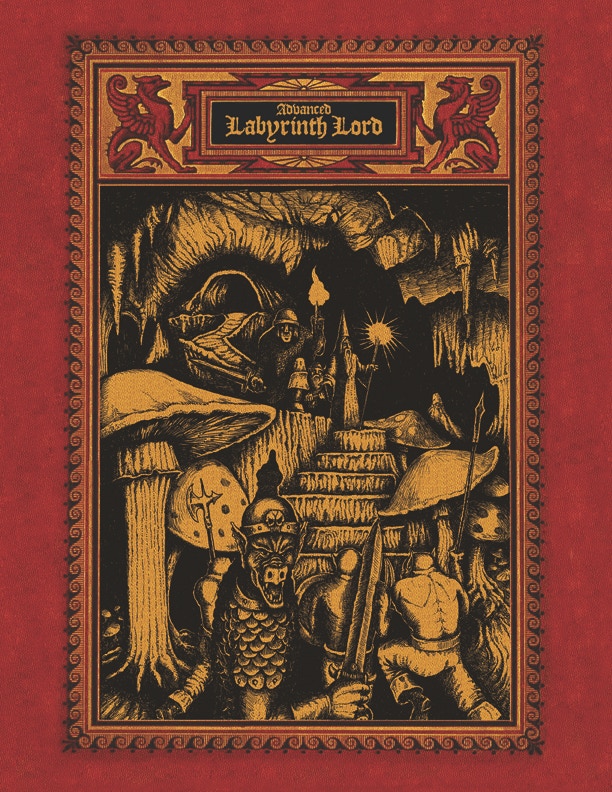
Art in gaming products (as landmarks)
Today, I read a bunch of posts about art in gaming products. Stephan Poag often writes thoughtfully on the subject. As one might expect from an artist, he is firmly in the pro-art camp. James Maliszewski tolerates art in moderation. A minority actively dislike art as “a very superficial unthinking gloss for fantasies,” but they are asses.
One thing about gaming art that I haven’t seen mentioned—perhaps because it’s so obvious—is its practical value as an aid to navigating texts. I tend to mentally index gaming books by their images, even when the content of the images doesn’t directly illustrate nearby text. It’s just a lot faster flipping through a book to recognize a picture than to recognize a block of text.
I suspect that’s also why new editions with replaced or rearranged art are so jarring—they disrupt that pattern recognition.
This is _not) to say that I think of art as a merely a superficial unthinking gloss.
4 comments:
scottsz, June 3, 2011 at 5:32 AM
This is an excellent point, particularly for works that have a high page count.
Stuart, June 3, 2011 at 8:02 AM
Excellent point, and so obvious that it’s easy to overlook and forget!
scottsz, June 3, 2011 at 9:57 AM
A general opinion question: If pages were designed with visual cues for sections (bands of color or decorative bands/icons), would the visual navigation concern be accommodated?
For myself, I’d rather have the ‘buoys’ of images within the page. I’m just curious.
Paul, June 3, 2011 at 10:59 AM
It would depend on the implementation and the nature of the book. A dictionary-style notched thumb index might be a nice feature for any thick alphabetical reference, like a monster collection.
I’m a bit of a minimalist, however, so I would not favor WotC-style decorative full-bleed borders.


