The Road Not Taken in D&D Art
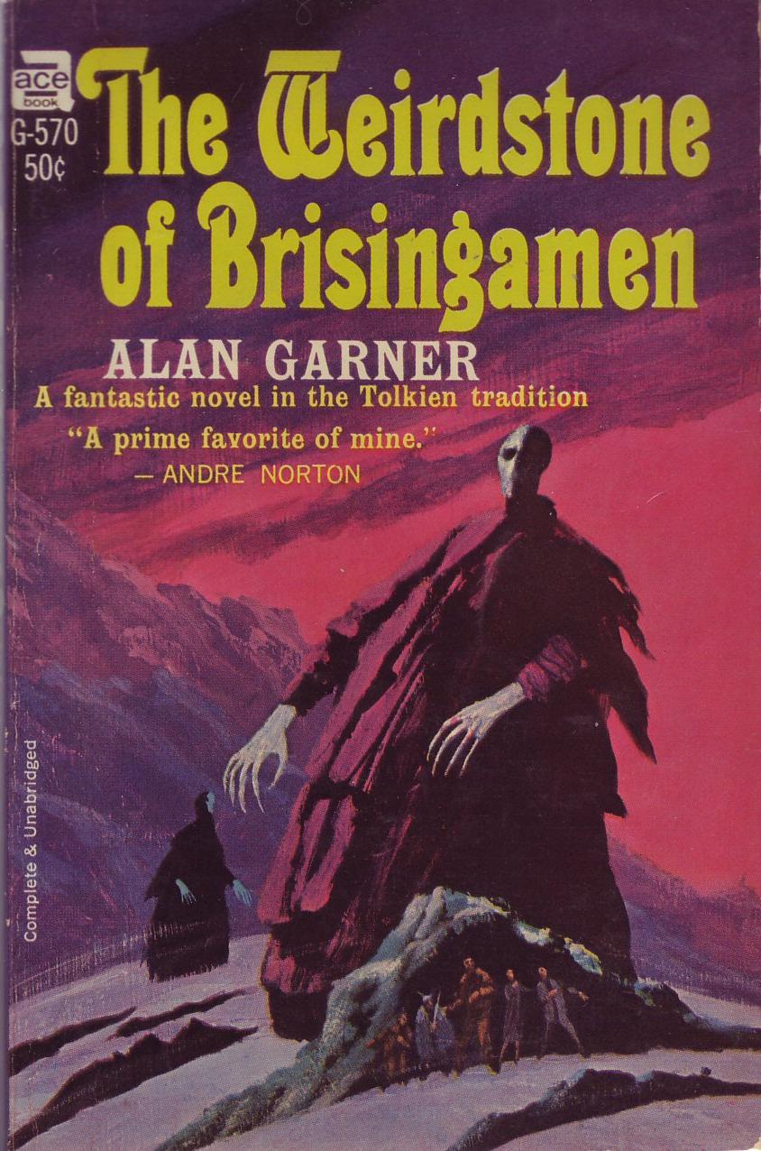
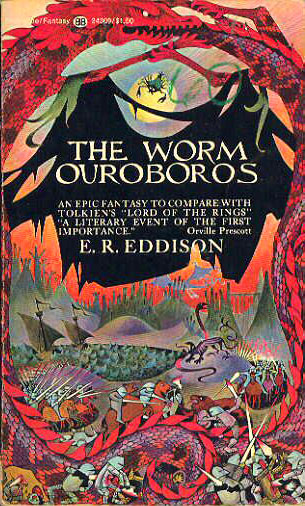
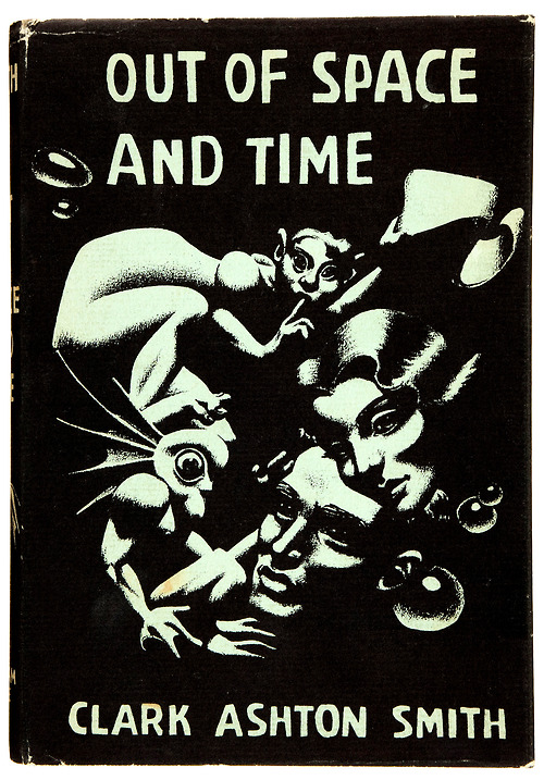
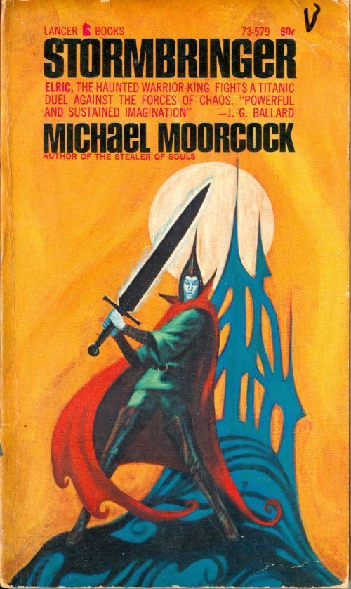
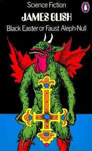
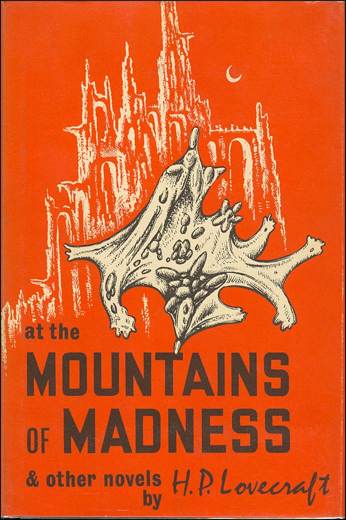
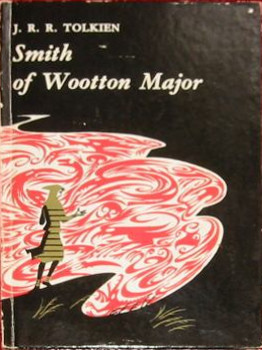
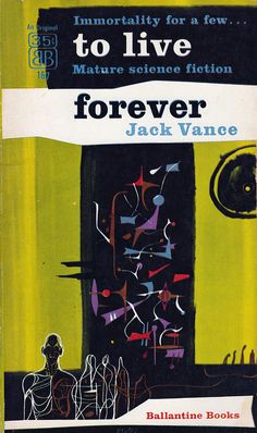
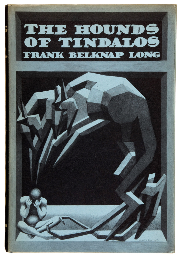
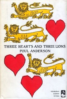
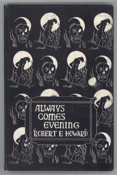
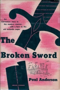
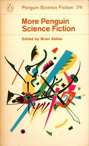
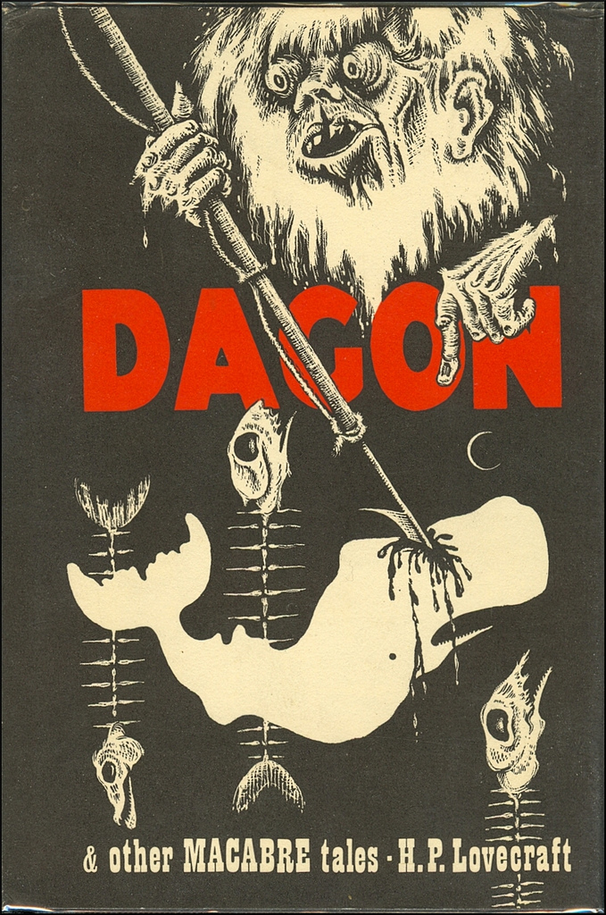
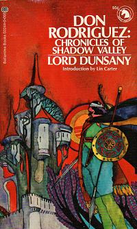
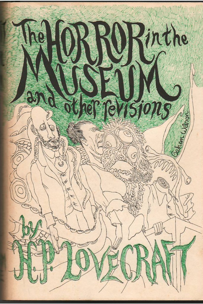
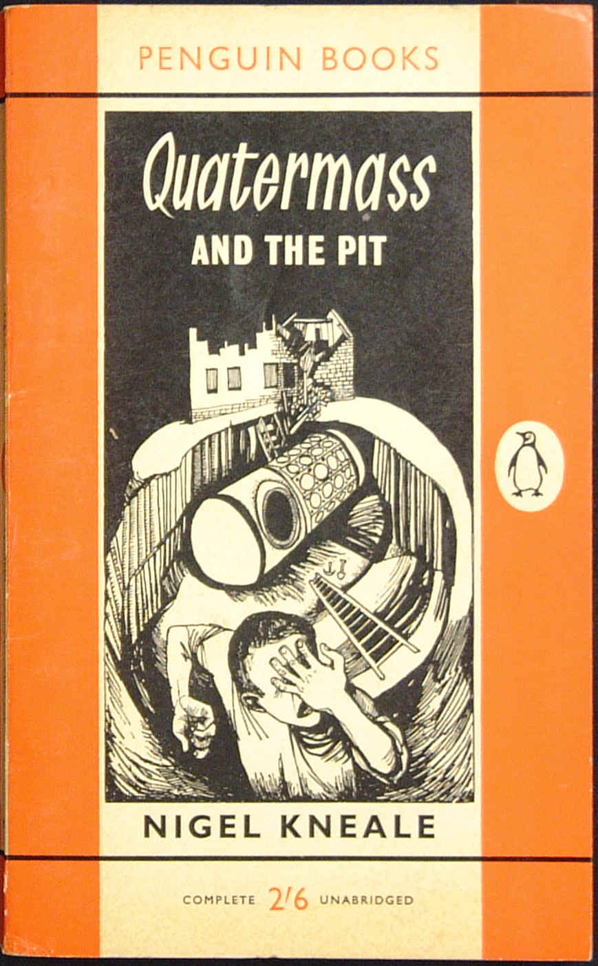
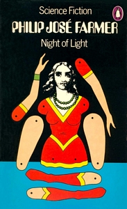
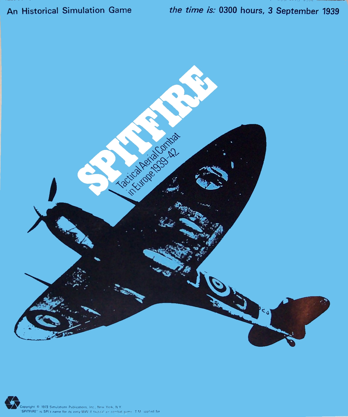
It’s not far fetched to imagine D&D might have started with a different artistic direction when we look at book covers of the period, including those from the Ballantine Adult Fantasy series, Penguin Science Fiction, or Arkham House.


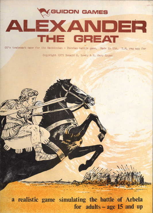
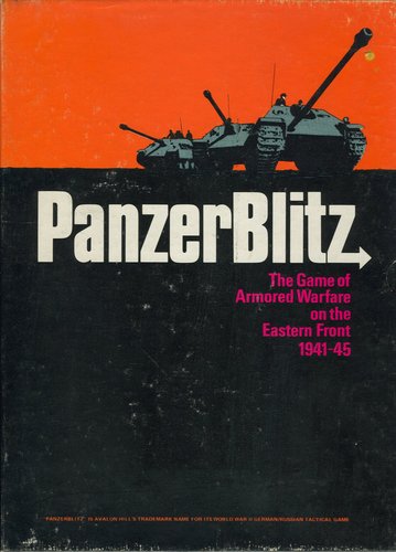
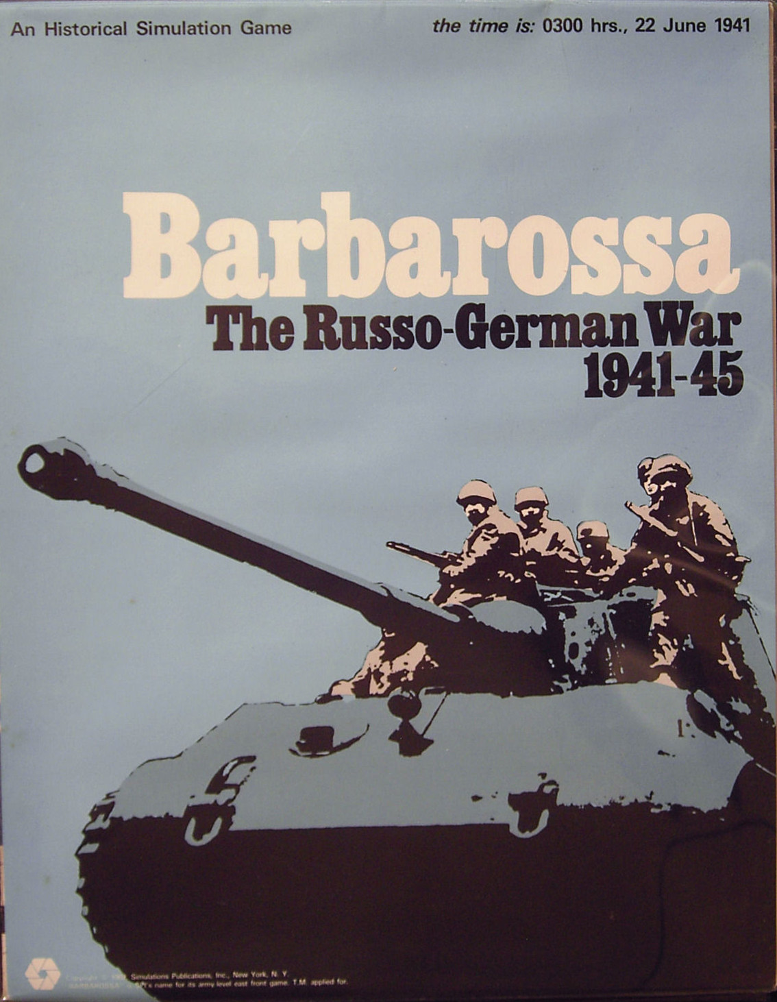
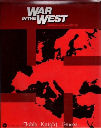
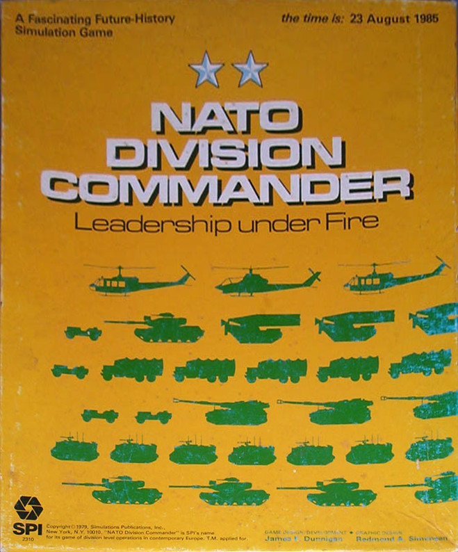
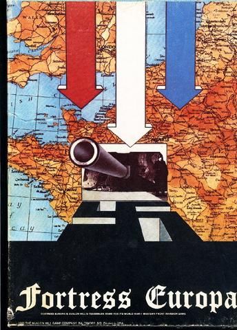
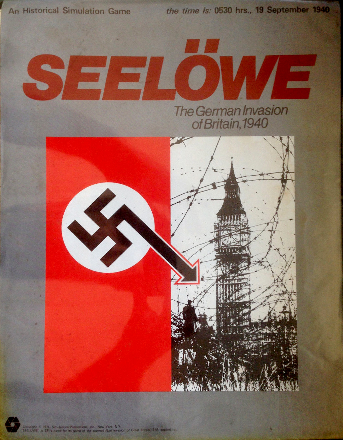
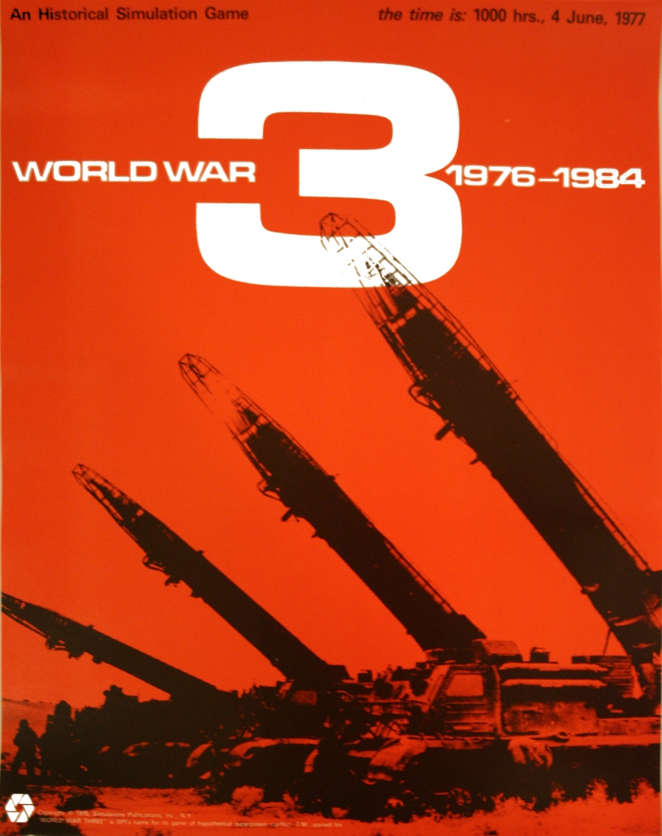
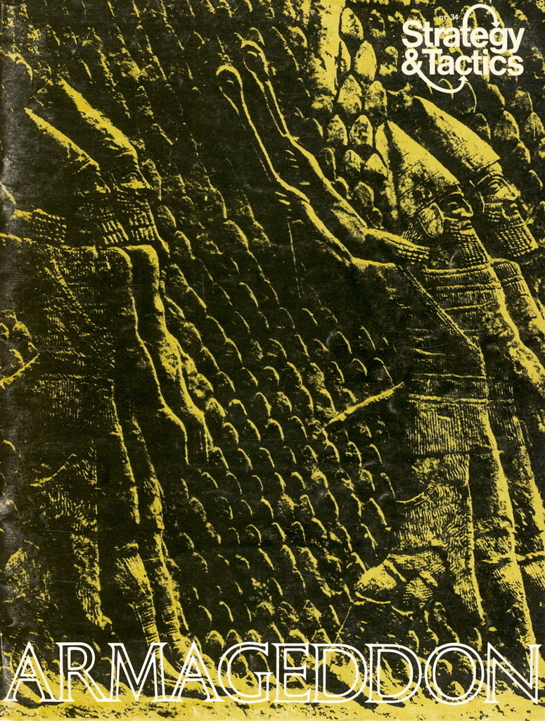
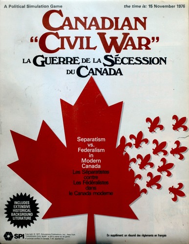
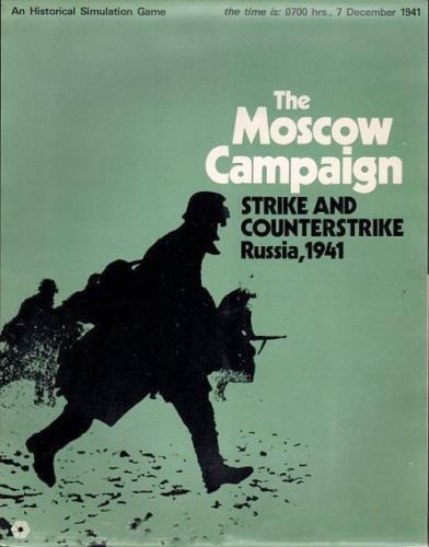
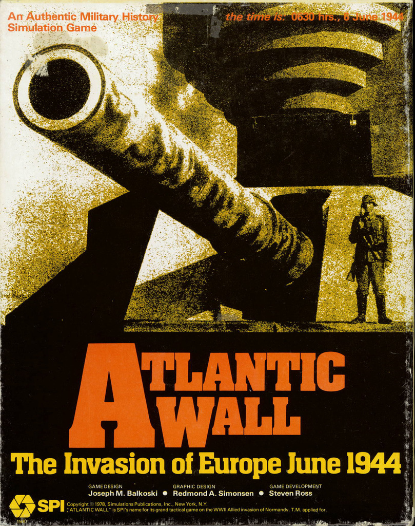
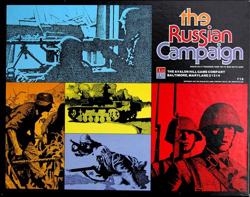
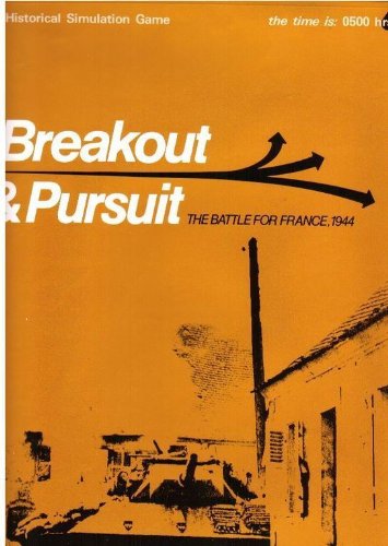
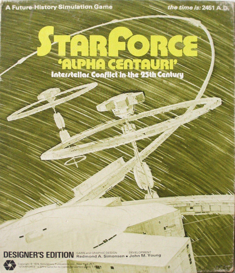
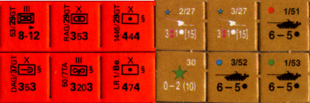
Wargames of the era offer similar examples, including one from Gygax.
While thinking about this, I wrote:
Game art is largely illustrative in function. The text describes an idea, the art shows it. Realism as a technique is more accessible and less open to interpretation than abstraction. For game rules (but perhaps not other game products?), accessibility and specificity are generally more desired than difficulty and ambiguity.
That’s obvious and not absolutely true, but it gave me two further thoughts.
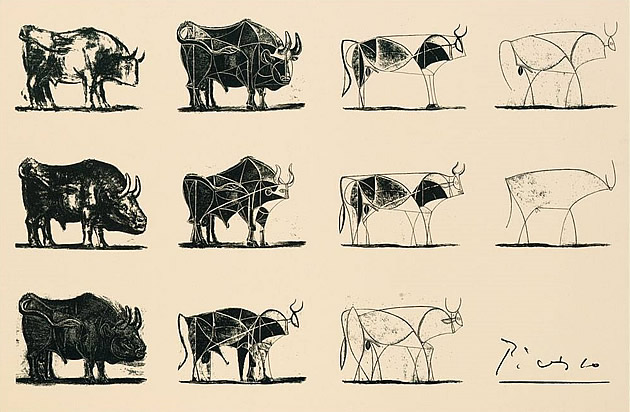
First, abstraction is used extensively in wargame design for the sake of clarity. Tokens evidence this especially, probably necessitated by their small scale; abstraction in this case is taking away inessential elements, like Picasso’s bull.
Second, the little brown books of OD&D are often described as difficult and ambiguous. What if the game was graphically as abstract?
10 comments:
Doug Anderson, February 9, 2015 at 9:08 AM
We could posit an alternate history where Avalon Hill buys out TSR in 1975, gaining their library of game titles including Cavaliers & Roundheads and a weird little game with no board and no counters called Dungeons & Dragons. D&D gets reissued as an Avalon Hill game, with punch-out counters and AH’s sleek, stark aesthetics.
Or you could just pretend that D&D was published in 1930: http://blueboxerrebellion.blogspot.com/2013/06/artifact-dnd-boxed-set-from-1930.html
Zenopus Archives, February 9, 2015 at 10:18 AM
Great post & selection of covers. I prefer paperbacks from the 60s-70s because of this style of art. Children’s books from this period had a similar style of cover art.
Timothy Brannan, February 9, 2015 at 10:43 AM
I love this time period of book covers.
Paul Gorman, February 9, 2015 at 11:13 AM
Good observation about children’s books, Zenopus. I think there’s something there about pop culture and high art and aspirations, but I haven’t worked it all out yet.
Stefan Poag, February 9, 2015 at 12:00 PM
This is a topic of interest to me; I was dissapointed to learn from Gary Gygax that he didn’t hire artists like Otus and Trampier because of their aesthetic; he hired them because they were willing to work for less. I think that much of the early TSR illustration has a vitality and style lacking in the later more photo-realistic work. I think some people want the illustrations to serve as documents that show the precisely correct numbers of fingers and toes on the goblins or the correct eye color on the earth elemental, etc., so any sort of license is frowned upon. I really enjoy when players draw their own characters on the character sheet… even if the player doesn’t really consider themselves an artist. The results are often surprising and full of character. As fra as those symbols on the AH game counters go, I assumed they came from military use since they usually represent units of infantry, cavalry, artillery, etc. Perhaps they came from Kriegspiel. Jon Peterson (Playing at the World) probably knows.
Stefan Poag, February 9, 2015 at 12:10 PM
Oh, and many of those book covers are fantastic. I particularly like the Quartermass cover, the Worm Orbouros and the Clark Ashton Smith covers.
charles mark ferguson, February 9, 2015 at 6:32 PM
Thankyou Paul. Interesting idea, especially (for me) the thoughts around function of art inside rpg products (Strange Stars has got me thinking about this too).
On a tangent: when I read “D&D might have started with a different artistic direction” my strong and immediate reaction was “Impossible!” My brain literally recoiled against the idea that seminal D&D could be truly represented with art so different from what it ended up with. My second thought was of course “Well, why not.” But the first reaction shows how powerfully a product can be linked with the way it’s represented (assuming I’m not a total outlier here). I think this also ties into the whole “D&D is now a genre” thing which I also find intriguing.
Bobjester, February 11, 2015 at 2:55 PM
I recall the not-so-recent outrages among some D&D players modern and old school that Greg Bell’s 0e art offerings were s***, but, I never held to that particular ideology, because as a fledgling artist in the 70’s & 80’s, I could not have done much better, and I’ve always tried to maintain that “if you could’ve done better by TSR in 1974” I’d accept your critique of Bell’s art as legitimate, if not functional.
Of course, when measured against today’s fantasy aesthetics, Bell’s critics have a lot more leverage, but I guess that depends on which set of lenses you’re wearing when looking at D&D as a pastime. I still look at it through 70’s tinted lenses, not because I’m nostalgic about the game, its that this version still evokes the same spark of creativity in me from my favorite period in fantasy & science fiction, a trend that still continues to influence me.
I never thought to compare Bell’s (or the other 0e artists’) 0e art with his novel cover artist contemporaries. I’d say that D&D in 1974 not only brought out a new style of gaming, but they were also on the cutting edge of packaging their product through the artistic visions of Greg Bell & company! In fact, I think that some D&D products could have been presented with art more abstract, but I think that D&D without DIS & DAT, Otus, Dee, Bell et al, would have been a mistake. Even some of Otus’ wilder pieces weren’t used in D&D (to my knowledge), that I particularly like and would love to use as illustrations in my games.
Charles Akins, March 3, 2015 at 6:50 AM
This post is really good! I added a link to it in my Best Reads of the Week Series for February 8-14, 2015.
http://dyverscampaign.blogspot.com/2015/03/best-reads-of-week-febraury-8-14-2015.html
TheShadowKnows, April 13, 2015 at 12:55 PM
I do feel some of the work by Otus is vaguely reminiscent of those paperback covers, but the overall aesthetic of early D&D is certainly not.


![[svg]](https://devilghost.com/publications/character-sheet.svg)